react-input-validator
Documentation
It’s common in an application that the user needs to fill the inputs or choose the options. There are some components that becomes the interface for user to make an input such as text box, radio button, check box, combo box etc. Sometimes, the user inputs need validation before being saved into database or continuing to the next process to make the application works correctly.
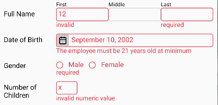
This package is to validate the input component and if the input value is invalid then an error message will be shown near the input component. If the value is valid, optionally, the clue that tells the value is valid can also be shown. The following picture below depicts some examples how the error messages are displayed.
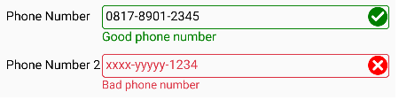
More fancy example which uses an icon to reflect the validation status:
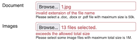
It can also validate the uploaded files:
How To Install
For web app, install the following package:
npm i @react-input-validator/web
For React Native app, install the following package:
npm i @react-input-validator/native
The Comparison between @react-input-validator and The Other System
Here, we explain the comparison with the other package or even the built-in validation stuff
in HTML DOM (Document Object Model). Not trying to compete those systems but
@react-input-validator tries to fill the untouched gap.
Schema-based validator
This kind of validator is quite popular. Therefore, we talk about it here. The example of this
kind of validator are zod and ajv. These
validators can validate a simple data up to a complex nested object. Whereas, in the other
hand, @react-input-validator can only validate the simple values. It’s because this package
is designed to validate the inputs inside the form that will be submitted to the server. In
fact, the form inputs retain the simple value, mostly a string or an array of string.
Another fact, the object of schema validator is the data itself. Whereas, the object of
@react-input-validator is the input components (the User Interface widget/control) which is
indirectly the data retained by the input components. So, what is the different?
@react-input-validator can show the error message near the invalid input component and
change their styling (appearance) whether they are invalid or valid.
Actually, @react-input-validator can also to validate the data directly. But it’s likely you
prefer to use schema-based validator for web API service.
Built-in HTML DOM (Document Object Model) validation stuff
The recent HTML DOM is equipped with a lot of stuff for the form inputs validation. I think, for basic to intermediate needs, it’s enough for you. Even you don’t need write any script because the form inputs are automatically validated just before submitted. If any invalid input, the form won’t be submitted.
You may set the validation via attributes: required, pattern, min, max, minlength,
maxlength etc. Some values for type attribute are also available for some special input
data type, such as date, time, number, url etc. If the value entered by user is not in
a proper format for those special data types, the input will be considered as invalid. When
the validation event happens, an error message will be shown according to what constraint has
been violated. In addition, you may set a custom message by invoking setCustomValidity
method (in this case, you must write a script).
For input styling, there are some CSS pseudo classes that can be used. You may use :invalid
or :valid. Also, :required may be useful.
Now, we talk about the conditions in which you may prefer @react-input-validator
These conditions happen, at least on all browsers I’ve known (Edge, Chrome, Firefox, Safari)
- Built-in validation only shows the error message for the first invalid input. So, if there are some invalid inputs, you must fix one input and then click submit button repetitively until all inputs fixed. In contrast,
@react-input-validatorcan show the error messages for all inputs at one click.- Built-in validation shows the error message as a toast popup. In other hand,
@react-input-validatorshows it as a reqular text. Technically. it’s a regular HTML element. Therefore, CSS applies to it. So, by using CSS, you can customize how the error message looks like, including like a toast popup.- Built-in validation cannot set the priority of which rule should be evaluated first. For example, for the following input:
<input type='text' name='text' required pattern='[a-z]+' minLength={3} />
On Gecko browser,minLengthis evaluated first and thenpattern. On Webkit browser, the first ispattern. All upto the browser, which rule is evaluated first. By using@react-input-validator, we can set which rule is evaluated first. It’s set by thepriorityproperty and the order inrulesarray.- By using Built-in validation, we cannot set a language other than English for the error messages. Perhaps,
setCustomValiditymay help.@react-input-validatoroffers more advanced validation rules, even you can create your own rule.
A Brief Example
React Native App
import React from 'react';
import {
    Button,
    StyleSheet,
    Text,
    TextInput,
    View,
} from 'react-native';
import {
    ValidationContext,
    withValidation,
} from "@react-input-validator/native";
import {
    email,
    required,
} from '@react-input-validator/rules';
import server from './server';

const UserName = withValidation(TextInput, {
    rules: [email, required],
});
const Password = withValidation(TextInput, {
    rules: required,
});

export default function LoginForm() {
    const validationRef = React.createRef();
    const [userName, setUserName] = React.useState('');
    const [password, setPassword] = React.useState('');

    return (
        <ValidationContext ref={validationRef}>
            <Text style={styles.title}>Please login:</Text>
            <UserName autoCorrect={false} onChangeText={setUserName} placeholder="Email" style={styles.input} value={userName} />
            <Password onChangeText={setPassword} placeholder="Password" secureTextEntry style={styles.input} value={password} />
            <View style={styles.buttonRow}>
                <Button
                    onPress={() => {
                        if (validationRef.current?.validate()) {
                            server.login(userName, password);
                        }
                    }}
                    title="Login"
                />
            </View>
        </ValidationContext>
    );
}

const styles = StyleSheet.create({
    buttonRow: {
        flexDirection: 'row',
        justifyContent: 'flex-end',
    },
    input: {
        borderColor: '#ccc',
        borderRadius: 4,
        borderWidth: 1,
        color: 'black',
        marginBottom: 10,
    },
    title: {
        marginBottom: 10,
    },
});
In this example, you may concern to withValidation and ValidationContext most. At a glance,
you may have concluded that withValidation is to specify the validation rules for the input
and ValidationContext is to validate all inputs inside it. Actually, each input can be
validated individually and doesn’t need to be put inside ValidationContext (see detailly
here). ValidationContext exists to validate many inputs
at once.
React Web App
import React from 'react';
import {
    Form,
    Input,
} from "@react-input-validator/web";
import {
    email,
    required,
} from '@react-input-validator/rules';

export default function LoginForm() {
    return (
        <Form action='/login' method='POST'>
            <h3>Please login:</h3>
            <Input rules={[email, required]} type='text' name='usename' placeholder="Email" />
            <Input rules={required} type='password' name='password' placeholder="Password" />
            <div style=>
                <button type='submit'>Login</button>
            </div>
        </Form>
    );
}
React web app looks more simple. There are Form and Input element. Input is replacement
of withValidation in React Native app. It extends the original input elenent. It adds
rules props to it. Form extends the original form element. It wraps ValidationContext
that should be placed next to form element. For detail explaination, please read
Form and Input section.
API Reference
Packages Structure
@react-input-validator is a package namespace which consists of some packages. Generally,
you must import the components and functions for React Native app from
@react-input-validator/native package. The components and functions for web app are imported
from @react-input-validator/web package. The rule objects are from
@react-input-validator/rules package.
The more complete list below shows the objects exported by the packages:
- ”
@react-input-validator/native” and “@react-input-validator/web” package export:arrayAsSingleAsyncFailMessageisDifferentStyleisFilledstrValidationValidationContext- type
ContextRef - type
InputRef - type
StyleProp - type
ValidationOption - type
Rule - type
Rules
- Beside those which are listed above, “
@react-input-validator/native” also exports:withValidation
- Beside those which are listed above, “
@react-input-validator/web” also exports:CheckBoxCheckBoxesFormgetStylePropsInputRadioButtonsSelectTextAreaValidatedInput- type
CompositeStyleProp - type
CheckBoxRef(refforCheckBox) - type
CheckBoxesRef(refforCheckBoxes) - type
InpRef(refforInput) - type
RadioButtonsRef(refforRadioButtons) - type
SelectRef(refforSelect) - type
TextAreaRef(refforTextArea)
All
*Reftypes extendInputRef. - ”
@react-input-validator/rules” package exports:alwaysValidbooleanBooleanValueCustomRuleCustomRuleAsyncEmailemailHttpReqhttpReqIntegerintegerLengthlengthlengthMaxMaxmaxMinminNumericnumericRegexregexRequiredrequiredruleruleAsyncValidationRuleValidationRuleAsync
This package will be installed automatically if you install “
@react-input-validator/native” or “@react-input-validator/web” package. - ”
@react-input-validator/rules-datetime” package exports:dateStrDateTimetime
- ”
@react-input-validator/rules-file” package exports:FileCheckfileCheckfileExtfileMaxfileTotalMaxfileType
ValidationContext
For React Native, it’s imported from
"@react-input-validator/native"
For React web, it’s imported from"@react-input-validator/web"
This element can validate all contained Input, TextArea, Select or inputs
that have been set by withValidation. Also, it can clear the validation
status of those inputs.
For web app, you may prefer
Form
Some props that can be set for this element are:
-
asyncFailMessage
Type: enum:AsyncFailMessage { Default, CaughtError }
When executingvalidateAsyncmethod, if it happens an error, this prop specify which error message should be displayed. By default, the displayed message is “cannot validate”. But, if the prop value isAsyncFailMessage.CaughtErrorthen the displayed message is taken from the message of the thrown error.
Default:AsyncFailMessage.Default -
auto
Type:boolean
Iftruethen all inputs inside it will be validated automatically when the user types/changes the input value.
Default:false -
Container
Type:React.ComponentType<{style?: StyleProp, children?: React.ReactNode}>
To make the input and the error message sticks together, both of them are contained inside a container element. ThisContaineris to specify the container component. For web app, you may needgetStylePropsto translate fromStyleProptoclassNameandstyleprop so that can be applied to the HTML element (Please read this section for additional information).If you feel this
Containeris unhandy because you use a CSS framework that can take care the layout, you can remove theContainerelement by following the example below:function Container({children}) { return children; } <ValidationContext Container={Container}> {/* The input elements here */} </ValidationContext>Just need to note: the error message is placed after the input element. Also, if there is an icon element yielded by
setStatusStyle, it will be placed between the input and the error message.
Default: For React Native, it’sView. For web, it’s a component which rendersdiv. ErrorText
Type:React.ComponentType<{ style?: [ StyleProp | undefined, StyleProp | undefined, ] | StyleProp, children?: React.ReactNode, }>It’s the component that displays the error message. For web app, you may need
getStylePropsto translate fromstyleprop of this component to HTMLclassNameandstyleprop (Please read this section for additional information).
Default: For web, it’s a component which rendersspan.Textfor React Native.
It seems no other option in React Native. All static texts must be contained inTextelement. But perhaps, you want to give some decorators to the error message, you can create a custom component and benefit thisErrorTextprop.-
errorTextStyle
Type: the same asstyleprop. Please read Style Handling.
The style for the error message when the input is invalid.
Default: sets red color to the text -
focusOnInvalid
Type:boolean
Iftruethen after validation, the first invalid input which hasfocusmethod will get the focus.
Default:false -
inputErrorStyle
Type: the same asstyleprop. Please read Style Handling.
The style for the input when the input is invalid.
Default: sets red color to the border and text lang
Type:function(string): string
This function is useful for the app whose multi language. This function is to translate the error messages which are in english to the active language. Read this section to inquire what messages need to translate.
Default:s => s(It means no translation)
Methods and property of ValidationContext reference (the object that we get from ref prop):
-
clearValidation
It executesclearValidationmethod of all contained inputs to clear the validation status of all contained inputs. -
isValid
is the property to check the validity status of all inputs inside the context. If there is an invalid input, this property will havefalsevalue. Otherwise it’strue. The value of this property is trusted after callingvalidateorvalidateAsync. -
getErrorMessage(name)
returns the error message that is being displayed for the input whose the name specified bynameparameter and inside the currentValidationContext. It returns an empty string if no error message displayed for that input. It returnsundefinedif no input whose suchname. -
getInput(name)
returns the reference of the input whose the name specified bynameparameter and inside the currentValidationContext. It returnsundefinedif no input whose suchname. -
refreshMessage
For a multi languange app, this method is useful to update the language of the error messages. This methods will re-validate all contained inputs so that their error messages are refreshed. Because of that, if the input is already valid then the error message will be gone. -
setErrorMessage(name, message)
This method is to set the error message for an input whose the name specified bynameparameter.messageparameter is the error message to show. The input must be inside the currentValidationContext. This method is useful when dealing with server-side validation. -
validate
It executesvalidatemethod of all contained inputs to validate all contained inputs. This method returnsfalseif any invalid input and returnstrueotherwise. -
validateAsync
It executesvalidateAsyncmethod of all contained inputs to validate them. This method returns aPromiseobject that will resolve tofalseif any invalid input ortrueif otherwise.
Form
In web app, ValidationContext should be placed next to form element to cover all inputs
that will be submitted to the server. Because of this, Form component exists to wrap both
components, ValidationContext and form. By using onSubmit event, Form component
arranges ValidationContext to execute validation. If any invalid input, the submit event
will be cancelled.
Coupling
ValidationContextandformelement is not a must. If you have another purpose, you may placeValidationContextelement wherever you want.
Form element has all props of form element, except noValidate. Built-in validation is
always disabled because @react-input-validator takes in charge now. Beside form props,
there is an additional prop:
contextPropsis an object containingValidationContextprops. This object will be delegated as the props of the wrappedValidationContext.
Methods and properties
Form component has all members of
ValidationContext and also all members of
form.
Input Component
An input that will be validated must be prepared, mainly, it must apply some validation rules.
An input can be validated individually or in a group. To validate a group of inputs, they must
be put in a ValidationContext.
For React Native app, an input is prepared by withValidation. For web app,
there are some components that mimic the HTML input elements. Technically, they
prepare the represented HTML input element when mounted (prepared just once, not every
render/update) so that the input can be validated.
Input validation options/settings
To prepare an input, there are some option properties that can be set to determine the
behavior of validation. For React Native, these option properties are assigned to the second
parameter of withValidation function. For web, these validation options
are assigned to settings prop of the input.
The list of input validation option properties:
-
asyncFailMessage
Type: enumAsyncFailMessage { Default, CaughtError }
The purpose of this option is the same asasyncFailMessageforValidationContext. If specified and inside aValidationContext, it will override the specified one forValidationContext. -
auto
Type:boolean
Iftruethen the input will be validated automatically when the user types/changes the input value. If specified and inside aValidationContext, it will override the specifiedautoforValidationContext. This option is ignored (cannot use auto validation) when you set one or more asynchronous rule forrules. -
Container
It’s the same asContainerprop ofValidationContext. If specified and inside aValidationContext, it will override the specifiedContainerforValidationContext. -
ErrorText
It’s the same asErrorTextprop ofValidationContext. If specified and inside aValidationContext, it will override the specifiedErrorTextforValidationContext. -
errorTextStyle
Type: the same asstyleprop. Please read Style Handling.
The style for the error message when the input is invalid. If specified, it will overwrite the specifiederrorTextStyleforValidationContext. -
inputErrorStyle
Type: the same asstyleprop. Please read Style Handling.
The style for the input when the input is invalid. It overwritesinputErrorStyleofValidationContext. -
lang
Type:function(string): string
It’s the same aslangprop ofValidationContext. It’s only used if the input is placed not insideValidationContext. So, it won’t override what is specified forValidationContext. -
setStatusStyle
Type:function(props, style, context): React.ReactNode
This function is called when executingvalidateorvalidateAsync. This function should change the input style to reflect the validation status (valid/invalid). This function also is executed in every render because the style is reverted to normal style bysetStylefunction. In which condition the function is executed, you can check the second parameter.
Parameters:propsis the props of input element. The prop you should care about is that which holds style value for the input, usually namedstyle.-
styleis the style value that should be assigned to the input style prop. When invalid, this parameter is an array of two entries, the first isinputErrorStyleofValidationContextand the second isinputErrorStyleoption. You may ignore this value if you have your own way to set the style.When the input is valid, this parameter has the falsy value. There are three possibilities of this falsy value:
nullif valid when executingvalidateorvalidateAsync. You may set a success style to the input such as decorating it with green border.undefinedif when executingclearValidation. Because of being cleared, you should not set any status style (valid/invalid). The style should be reverted to normal.falseif when rendering process
The better comprehension may you get from this example and its counterpart for web app.
contextis an object which has three members:clearValidationis a method to ask to clear the validation status. The input style will be reverted to normal.flagis a property to help you to save the state of style changes. It’s to avoid unneeded repeated action. By default, its value is0. The value can be set to any data type. Please see this example how to use it.normalStyleis a read-only property. It’s the normal style, that is the original style before altered to invalid/valid style. It can be used to revert back the style or to be combined with the invalid/valid style. Because, the invalid/valid style is usually based on the normal style with different color.
Return Value:
This function may return aReact.ReactNode. TheReact.ReactNodemay display an icon which represents invalid/valid status. The icon will placed between the input and the error message. But, by using absolute positioning, you can place the icon at the left/right side of the input. You can see in this example or its counterpart for web app.Default:
A function that will set the style based on the second parameter (styleparameter) when invalid and set the style to becontext.normalStylewhen valid. To set the style, it callssetStylewithout the third parameter.
Beside the properties above, below are some properties which are only available for
withValidation (there is a note for each property why it doesn’t exist
for web input):
-
getStyle
Type:function(props): StyleProp
This function is to get the style specified for the input. The function will be given thepropsobject of input as the parameter and it must return the value of a prop which defines the style. Usually, the prop name isstyle.If the input is a composite component, the returned value must be the style for the root element of input. For example, below is an input which consists of the composite component:
function PercentageInput({ containerStyle, inputStyle, percentStyle, ...props }) { return <View style={[ containerStyle, {flexDirection:'row'} ]} > <TextInput style={inputStyle} {...props} /> <Text style={percentStyle}>%</Text> </View> }getStylemust returncontainerStylefor above input.Default:
props => props.styleFor web inputs,
getStylealways read fromstyleprop getValue
Type:function(props): any
This function is to get the value of the input. The function will be given thepropsobject of input as the parameter and it must return the value of a prop which stores the input value. You really have to specify this function if the input value is not stored in the prop namedvalue. If not, the validation won’t work.
Default:props => props.valueFor web inputs,
getValuealways read fromvaluepropname
Type:string
The name for the input. It’s useful if you want to show the name in the error message. Please read Messages section andstrfunction for more information. It’s also used by some methods ofValidationContext.For web inputs, the name is determined by
nameprop of the inputrules
Type: rule object or array of rule objects
It’s the validation rules of how the input to be validated. You must specify it. If not, the input component will be unmodified (won’t be validated).For web inputs, this option property is replaced by
rulesprop-
setStyle
Type:function(props, style?: StyleProp | Array<StyleProp | undefined>, containerStyle?: {style?: StyleProp})
This function is to set the style for the input (and/or itsContainer). This function must be defined if the input style prop is named other thanstyle. Beside that, this function may be a corrective action to fix the style because of how this package prepares the style (please read thissectionfor more information).
NOTE: It’s not the opposite ofgetStylewhich expects the composite style of the input element and itsContainer. WhereassetStyle, on other hands, sets the style to the input directly.The first parameter is the input props. The second one is the style that should be applied to the input. The third parameter is useful if you want to modify the style for the
Containerelement. BecausesetStyleis invoked in every render, just make sure it won’t mess up the layout/appearance when executed more than once.Default:
(props, style) => props.style = styleFor web, it’s always
(props, style) => Object.assign(props, getStyleProps(style))
withValidation
This function is to create a higher-order component that wraps an input component so that it can apply some validation rules and also some attributes needed to define the behavior. You can see in the example above that this function takes two parameters. The first parameter is the function/class component that will be validated.
The second parameter is the option object. The object has some
properties which specify validation rules and the other
attributes. The only property you must specify is rules. The other properties are optional.
If you only need to set the validation rule(s) for the input, the second parameter can be a
rule object or an array of rule objects.
This function is available for React Native app.
Web input
For web app, there some input components that is automatically validated. Some of these inputs mimic the standard form inputs. These inputs generally have the same props/attributes as HTML inputs. However, there are some differents:
defaultCheckedanddefaultValueare dropped. A validated input is always a controlled input. Internally, the validated input maintains a state for the input value. It’s needed because the validator needs to read from thevalueprop.- Because it’s internally contolled, when
valueprop is set, the input value doesn’t stick tovalueprop (it may be changed later without changingvalueprop). However, we may still define a state forvalueprop and its appropriateonChangehandler. classNameis dropped. CSS class name(s) is also assigned tostyleprop (Please read this section for additional information). It’s because how@react-input-validatorworks (related togetStyle).- New prop:
rulesdefines the validation rules for the input. It can be a rule object or an array of rule objects. Even if this prop can be updated in every render, but usually it doesn’t change. If it never changes and there is a rule object needs quite heavy process to create, it’s better to create the rule object outside the function component orrendermethod of class component so that it’s not recreated in every render. - New prop:
settingsis the validation option properties as explained in the above section. This prop is only read at mounting and in the next renders, this prop is ignored.
The available input components:
Input, Select and TextArea
Input, Select and TextArea represents HTML input, select and textarea respectively.
They have the same props as ones owned by their represented HTML element except some notes
explained by above paragraph.
Data type of value prop of Input mostly is string. If type prop is number or range,
value data type is number. If type prop is file, don’t you set value prop but if you
set onChange handler, event.target.value will be an array of File.
Data type of value prop of Select is string by default. If multiple prop is set,
value data type is an array of string.
CheckBox
An HTML checkbox (<input type="checkbox" />) will be submitted to the server when it’s
checked. If unchecked, its name and value will never be submitted. On server, to check whether
the checkbox was checked or not, we must check the existence of the request parameter related
to the checkbox. We can use
has method of FormData.
So, we just need the name of the checkbox. If there is no other checbox whose the same name
then we may ignore the value of the checkbox.
To deal with a group of checkboxes whose the same name, please use
CheckBoxescomponent.
This component, CheckBox, on the other hands will be always be submitted to the server.
The value which is submitted to the server is the string "true" or "false" which reflects
whether the checkbox is checked or not. Beside these values, a checkbox may send an empty
string value if it’s in the
indeterminate
state. Internally, it uses <input type="hidden" />.
CheckBox has most of the props of regular HTML checkbox with the exceptions explained in
this section. In addition to those notes, there are some more notes for
CheckBox:
checkedprop is dropped. It’s covered byvalueprop.- No
typeprop because it’s always “checkbox”. valuecan be set with a boolean valuetrueorfalseto set the checkbox to be checked or unchecked (the same way as we usecheckedprop of a regular checkbox). Beside a boolean value, we may setvaluetonullwhich makes the checbox to be indeterminate state.
Beside that, CheckBox has new prop:
noIndeterminate
It has a boolean value. It it’struethen no indeterminate state which meansvalueprop cannot benull. This prop is optional which defaults tofalse.
The indeterminate state is not only able to be set programmatically by setting value prop
to null, but it can also be set by the user action. When the checkbox is checked, if it’s
clicked then it turns to the indeterminate state. If it’s clicked again, it will be
unchecked. The next click will turn back the checkbox to be checked again, and so on. If
noIndeterminate is true then the clicking action only alters from checked to unchecked
state and vice versa.
The example below shows the rules that may be applied to CheckBox element:
  <CheckBox
      name='agree'
      rules={[required, boolean, rule(isAgree => isAgree, "You must agree!!!")]}
      value={null}
  />
required rule disallows the checbox to be in the indeterminate state.
boolean rule makes sure the value can be interpreted as true or false and,
if needed, converts it to a boolean value. This rule is really needed if the validation
happens on the server because the value is sent as a string value.
CheckBoxes
CheckBoxes is a group of some <Input type='checkbox' /> whose the same name prop.
Sometimes, this input is preferred representation of <Select multiple> if there are only the
slight number of options. This conponent has the following props:
nameasinput’snamevalueasinput’svalue. Its data type is an array of string. It may be astringif only one selected.horizontaldertemines the layout of checkboxes. If it’strue, the checkboxes will be laid horizontally. By default, the layout is vertical.optionsis an array of object{value: string, label?: string}or astringarray.valueof an option is thevalueof the checkbox and itslabelis for the checkbox’ label. Iflabelis not defined then it’s the same asvalue. Ifoptionsis astringarray then it means allvalueand itslabelare the same.
valuewill be compared tovalueof each option to determine whether the corresponding checkbox is checked or not. Remember, this component is internally controlled, so, the selected checkbox(es) doesn’t stick tovalueprop and may be changed later without changingvalueprop. Still, you may define a state forvalueprop and its appropriateonChangehandler.
optionsis a required props (must be set).- Other common HTML element props and validation input props.
Available CheckBoxes method:
Example:
<CheckBoxes
  rules={alwaysValid}
  options={['Music', 'Movie', 'Sport', 'Other']}
  value={['Music', 'Movie']}
/>
The above example will show four checkboxes labeled as ‘Music’, ‘Movie’, ‘Sport’ and ‘Other’ with ‘Music’ and ‘Movie’ are checked.
RadioButtons
RadioButtons is a group of some <Input type='radio' /> whose the same name prop. In fact,
radio input should be in a group to make a choice. Sometimes, this input is preferred
representation of <Select> if there are only the slight number of options. This component
has props/method as the same as the props/method of CheckBoxes except value
data type is always a string.
Example:
<RadioButtons
  horizontal
  options={[
    {value: 'M', label: 'Male'},
    {value: 'F', label: 'Female'},
  ]}
  rules={required}
  value='M'
/>
The above example will show two radio buttons labeled as ‘Male’ and ‘Female’ with ‘Male’ is checked.
ValidatedInput
If the above inputs are not enough, ValidatedInput gives you a freedom to define an input.
Beside rules and settings prop,
ValidatedInput has Component prop. The last prop is an input component. You can assign
your custom input component to this prop. The rest props (other than rules, settings and
Component) assigned to ValidatedInput element will be delegated to the input element
defined by Component prop.
Component prop is only read at mounting. In the next renders, this prop is ignored.
Methods and properties of the input reference (the object that we get from ref prop):
-
clearValidation()
It’s to clear validation status. The error message will disappear and the input style is reverted to normal. After executing this method,isValidwill be reset totrueeven if the input is invalid. Ifautovalidation is disabled, this method will be called when the user edits the input value right after the validation. -
getErrorMessage()
This method returns the error message being displayed for the input. It returns an empty string if no error. -
getValue()
If the original input ref has a property namedvaluethen this method will return its value. Otherwise, the returned value is from thegetValuefunction defined in option parameter. -
isValid
It shows the validity status of input. It’strueif valid andfalseif invalid. The value of this property is trusted after callingvalidateorvalidateAsync. -
name
It’s the name of input. The value of this property is the same as that specified fornameoption ornameprop of web input. -
resultValue
It is the value yielded by the validation process if the input is valid. So, it’s trusted after callingvalidateorvalidateAsync. The value is the same as one fromresultValueof the last examined rule object. -
setErrorMessage(message)
This method can set the error message for the input without callingvalidateorvalidateAsync. It won’t validate any rule that has been applied to the input. By calling this method, the input status becomes invalid (isValidproperty isfalse).For example, we need to validate the input on the server because we must read the database to make sure the inputed user name is unique. (NOTE: The example below should be solved using asynchronous validation interfaces).
const validateAsync = () => new Promise((resolve, reject) => {
    fetch(
        `https://yourserver.com/validate/unique-user-name?uname=${encodeURIComponent(userName)}`
    ).then(async (response) => {
        if (response.ok) return response.json();
        reject(await response.text());
    }).then(data => {
        if (data.userNameExists) {
            userNameInput.current?.setErrorMessage('The user name has been used');
            resolve(false);
        }
        else {
            resolve(true);
        }
    }).catch(err => {
        reject(err);
    });
})
.catch(err => {
    /*If there is a problem with the server, you may tell the user here or you may just keep it silent and
      try to re-validate it on the server when the form is submitted. In fact, backend validation is still
      needed all time to avoid tampered data.*/
    //userNameInput.current?.setErrorMessage('The server cannot validate');
});
<UserNameInput ref={userNameInput} onBlur={validateAsync} onChangeText={setUserName} value={userName} />
Another example, when the validation process yields an error:
<UserNameInput ref={userNameInput} onChangeText={setUserName} value={userName}
   onBlur={() => {
      try {
          userNameInput.current.validate();
      }
      catch {
          userNameInput.current.setErrorMessage('An error happens when validating');
      }
   }}
/>
Need to remember that
rulesoption is required. If you want to usesetErrorMessagemethod but doesn’t need to apply any validation rule, you can usealwaysValidrule. -
validate()
This method is to validate the input based on the specified rules. Below is the example how to validate input when it’s lost focus.<NameTextInput ref={nameInput} onBlur={() => nameInput.current?.validate()} onChangeText={setName} value={name} />This method returns
trueif input value is valid orfalseif invalid. This method will throw an error if there is a rule object which does the asynchronous validation. -
validateAsync()
Asvalidate, this method is also to validate the input based on the specified rules but the process is executed in asynchronous mode. This method returns aPromiseobject that will resolve totrueif the input value is valid orfalseif otherwise.
If the original input has the same methods and properties as listed above, they will be overriden. If you want to access the overridden method/property of original input, follow the example below:
const inputRef = React.useRef();
...
<Input ref={inputRef} onBlur={() => {
    //This statement will validate the input
    inputRef.current.validate();

    //This statement will invoke `validate` method of original input
    inputRef.current.__proto__.validate();
}} ... />
Validation Component
For React Native, it’s imported from
"@react-input-validator/native"
For React web, it’s imported from"@react-input-validator/web"
Validation component can be used to validate a value without wrapping an input component.
It has some properties which are the same as
withValidion option. These properties are auto,
errorTextStyle, lang, name and rules. The purpose of these properties are exactly the
same as withValidion option’s. These properties are write-once. They are only set when the
component is mounted. If you change the properties in the next render, it won’t have effect.
Beside the properties mentioned before, there are two more properties:
styleis the style forContainercomponent rendered byValidationcomponent. See Style Handling section, which style attributes that have effect.valueis the validated value. It can be an actual value or a function. If it’s a function then the function will be executed to get the real value. The fuction is useful to create a dynamic value.
Validation object reference also has the same methods and property as
those owned by input component reference resulted by
withValidation
Example:
import React from 'react';
import {... TextInput, ...} from 'react-native';
import {Validation, ValidationContext} from "@react-input-validator/native";
import {email, required} from '@react-input-validator/rules';
...

export default function Form() {
    ...
    const [emailAddress, setEmailAddress] = React.useState('');
    ...

    return (
        <ValidationContext ref={validation}>
            ...
            <TextInput onChangeText={setEmailAddress} placeholder="Email" value={emailAddress} />
            <Validation rules={[required, email]} value={emailAddress} />
            ...
        </ValidationContext>
    );
}
You notice this example, the value of Validation is the same as the value of email
TextInput. By this way, it’s like to apply the use of withValidation to the email
TextInput.
Style Handling
React Native
To make the input and the error message stick together, withValidation
wraps them into a Container component. However, we want the
component yielded by withValidation behaves the same as the original
input except we add the validation feature to it. All properties for the input must apply for
the new component. Every property seems ok, we can just distribute them to the wrapped input.
Except one property we think it has a problem. That is the property which defines the style
for the input. Because now, the input is inside the Container. We must modify the style
property if we still want the same style as if the input is unwrapped. The big concern is all
style attributes dealing with layout. That is how the parent of input arranges the area for
input, before. Because now, the parent must arrange the Container. Therefore, the component
yielded by withValidation will move all style attributes dealing with
layout to be the style attributes of Container. Then, the input must be set to fill the area
of Container.
We know, the value for style prop is not always a plain object or a falsy value but it can
be a recursive array. Therefore, the first step is to flatten it if it’s an array. Fortunately,
React Native has provided StyleSheet.flatten function to do that. After getting a single
plain object, the following style attributes will be assigned to the Container:
alignSelfbottomdisplayendflexGrowflexShrinkflexBasisleftmarginmarginBottommarginEndmarginHorizontalmarginLeftmarginRightmarginStartmarginTopmarginVerticalmaxWidthminWidthpositionrightstarttoptransformwidthzIndex
Some other attributes will be moved to the Container under a condition:
height,minHeightandmaxHeight, if having the percentage value.flex, if greater than 0.
To make sure the input fills the area of the Container, its flex attribute is set to 1 if
the Container has one of attributes: height (percentage), flex or flexBasis. But if
the input has height (number) attribute, the flex attribute won’t be set.
There are two handlers you may define in withValidtion option which involves in this
modification of style. Those are getStyle and
setStyle.
There is still a possibility that the layout will mess up when the error message comes up.
That possibility happens, especially when the parent of input (that becomes the parent of the
Container) lays its children horizontally (flexDirection is row). To avoid it, you
should set a fixed height (not percentage) for the input.
The process explained above is executed in every render. To increase performance, it must be
sure that the process is run only if the style value changes. To do that, the package has
isDifferentStyle function. You can import this function for your own purpose. This function
does more detailedly than a shallow compare. Let’s explain in the example below:
const style1 = {flex: 2},
      style2 = {flex: 3};
isDifferentStyle(style1, style2); //return true
isDifferentStyle(style1, [style1]); //return false
isDifferentStyle([style1], [style1]); //return false
isDifferentStyle([style1, style2], [style1, style2]); //return false
isDifferentStyle([style1, style2], [style2, style1]); //return true
isDifferentStyle(style1, [style2]); //return true
isDifferentStyle([style1], [style1, style2]); //return true
So, the function simply just compares the entry in the array at the same index. The more detailedly logic can be done to make sure that they are really different but it can cause a more complicated process that won’t help increasing performance.
To help increasing performance, you must also set the style value to a constant value, not variable. For example:
const styles = StyleSheet.create({
    input: {borderWidth: 1, ...},
    hightlight: {...},
});
const Input = withValidation(TextInput, ...);
...
export default function Form(props) {
    ...
    return (
        ...
        //It's BAD example
        <Input style= ... />

        //It's good
        <Input style={styles.input} ... />

        //If you want to make a different style for
        //a condition, it's a good example
        <Input style={[
            styles.input,
            highlighted ? styles.hightlight : null,
        ]} ... />
        ...
    );
}
React Web
Firstly, this library was designed for React Native. But then, the writer thought that there
is a need to port the library for React web. There is a big obstacle to rewrite this library
to support web app that is the style handling. The style in web, which is called CSS
(Cascading Style Sheet) is very complicated. There are many shorthand CSS properties. A
shorthand CSS property represents some other specific properties. It’s not simple process to
parse. Therefore, we use the different approach for React web, the style must be explicitly
set to the input and its Container.
Beside that, an element style is determined by a lot of selectors: tag/element name, the
existence or the value of a prop/attribute or even by the parent/ancestor element and the
sibiling elements. However, the are two main props to define the style: className and
style. This library will focus on those two props.
Based on the above explanation, we make the following approach. Let’s say we define
StyleProp that is the data type for style prop of individual component (the input or its
Container). A validated input that is a composite component
(the original input and its Container) has style prop whose type as follows:
{ $cover: StyleProp, $input?: StyleProp } | StyleProp
$cover is for Container and $input for the original input component. An alternative way
is we can assign a StyleProp value to style prop. It means we want to set the input only
and let Container uses the default style. StyleProp itself is defined as follows:
string | CSSProperties | { $class: string, $style: CSSProperties }
If it’s string then it’s the CSS class name(s) (will be assigned to className prop of the
underlying HTML element). If it’s CSSProperties then it’s inline style (will be assigned to
style prop of underlying HTML element). If we want to set both, we use {$class, $style}.
This library provides getStyleProps function to convert
StyleProp or array of StyleProp to be {className, style} object. This function may be
useful if you want to implement setStatusStyle function.
Asynchronous Validation
In some cases, we need to execute the validation process in asynchronous mode. The prominent
example is when we need to call back the server to check the validity of input value. May be,
we need to check the database to ensure the input is valid or not. For making an HTTP request
purpose, this library has provided httpReq rule.
To make the process of validation in asynchronous mode, first thing you need is a rule object
that can validate a value asynchronously. This library has provided some rule objects that can
make the process asynchronously. One of them has been mentioned before, that is httpReq. The
another one is ruleAsync. If these rule objects don’t satisfy you, create your
own rule class which inherits ValidationRuleAsync class.
After you defines the asynchronous rule(s), as usual, set the rule(s) to
rules option of withValidation or
rules prop of the web input. You may mix asynchronous and synchronous
rules. priority property still applies as appropriately
(an asynchronous rule won’t be examined after a synchronous rule that has lower priority).
The last step, to validate the input(s) asynchronously, you must call
validateAsync method of the input reference or
validateAsync method of the context reference.
Both methods return a Promise object. So, if you want to get the validation result, you
should use the following statement:
inputRef.validateAsync()
    .then(isValid => {
        //... rest of your code
    });
or
let isValid = await inputRef.validateAsync();
The last statement must be inside an async function.
Server-side Validation
@react-input-validator library is to validate inputs in React Native app or an HTML form. In
other words, it’s for client-side validation. By the existence of client-side validation, we
are more confident to submit data to the server. However, is it enough? Absolutely not. A
hacker can make a request without using our app and use an invalid data. So, the server-side
validation is always needed exactly as if we are not using a rich user interface application
(like an oldish web app).
Then, you may think that if we use a rule like httReq then the server-side
validation has been done because the validation by this rule is examined on the server.
Unfortunately, it’s not. We must validate the inputs right before they are used by the
corresponding business process. Clearly, the URI used by httpReq is different from that to
where the data is submitted. Knowing this fact, you may think that a rule like httReq is not
needed because there will be more round-trip. Yes, you are true but people always have
different preference and there may be a situation it’s needed.
Now, if we agree that the server-side validation is needed then how to notify user if there
is one or more invalid inputs. You may use an alert dialog or a Toast popup. But, it may be
better if we show each error message below the corresponding input with hightlighting style
like this library does in client-side validation. It’s possible by the favor of
setErrorMessage method. Follow the example
below. In the example, if there is one or more invalid inputs, the server returns status code
400 (Bad Request) and the response body is a JSON data key-ed by the invalid input
names. The value of each key is the error message for that input.
    <Button
        onPress={() => {
            function okAction() {
                //The code to be executed when all inputs are valid ...
            }

            fetch('https://yourserver.com/check-password', {
                body: JSON.stringify({passord, confirmPassword}),
                method: 'POST',
                headers: {
                    'Content-Type': 'application/json'
                }
            })
            .then(async (response) => {
                if (response.ok) okAction();
                else if (response.status == 400) {
                    const errors = await response.json();
                    for (let inputName in errors) {
                        contextRef.current.setErrorMessage(inputName, errors[inputName]);
                    }
                    if (contextRef.current.isValid) {
                        //Although, the response status is invalid but no error message provided.
                        //Therefore, we consider all inputs are valid.
                        okAction();
                    }
                }
                else {
                    Alert.alert('Validation', 'Server response is not OK');
                }
            })
            .catch(() => {
                Alert.alert('Validation', 'An error happened.');
            })
        }}
        title="Validate on server"
    />
To keep consistency, the logic used for the server-side validation must be the same as that
used by client-side validation. If you use Node server, you may use @react-input-validator
library. For example:
    const {
        validate
    } = require("@react-input-validator/helpers");
    const {
        required,
        rule,
        length,
    } = require('@react-input-validator/rules');
To validate an input, follow the example below:
    const passwordRules = [
        required,
        length(8),
        rule(
            value => {
                return /[a-z]/.test(value) && /[A-Z]/.test(value) && /[0-9]/.test(value) && /[^a-zA-Z\d\s]/.test(value);
            },
            'The password must contain capital and non capital letter, number and non-alphanumeric characters'
        ),
    ];
    errMsg = validate(inputValue, passwordRules, inputName);
    if (typeof(errMsg) == 'string') {
        errors[inputName] = errMsg; //the error message is collected for the response data
    }
Asynchronous validation is still needed in server-side validation, for example, if we need to connect to database to check the validity of input. Database connection is usually in asynchronous mode.
Rule Object
Rule object defines how to validate the input value. For example whether it’s required (cannot
be empty), must be a numeric value, must be minimum at a certain value etc. The rule object is
reponsible to check whether the input value meets the desired condition or not, to be valid.
Mostly, one rule object is responsible to check only one condition. However, we can combine
some rule objects so that the input value must meet some conditions to be valid. This is why
withValidation rules option can be a single rule
object or an array of rule objects.
This libray has packaged some rule objects which are ready to use. These
rule objects are explained in the next sections. You can create your own rule object by
creating a class that extends ValidationRule or
ValidationRuleAsync. The common rule objects are imported from
@react-input-validator/rules package.
ValidationRule
This is the base class for all rule objects. Therefore, all object rules must have all properties and methods explained here.
Properties:
-
errorMessage
Read-only. The error message if the input is invalid. If you define a new rule class, you should override this property to return the default error message. The value of this property can be a template string that can include some properties of the defined rule object. For example:"${name} is invalid. ${value} is not valid phone number". inputValues
It’s an object key-ed by allnameof inputs inside the same context and the value for each key is the coresponding input value which is fromgetValuemeethod. It’s useful forvalidatemethod if it needs another input value to validate. For example, if we want to create a custom rule to validate a confirmation password,validatemethod may look like this:validate() { this.isValid = this.value == this.inputValues['password']; return this; }This property is set by
validateorvalidateAsyncmethod of the input ref.-
isArrayAsSingle
Read-only. It’s value is set byarrayAsSinglemethod. Please read the explanation ofarrayAsSinglefor further information.
Default:falseexcept forlengthrule and file rules, it’strue. -
isValid
It’strueif valid andfalseif invalid. It’s set byvalidatemethod. Therefore, it’s trusted just after callingvalidatemethod. -
lang
is a function to translate the error message to the active languange. By default, the message is in english. It will be set byvalidateorvalidateAsyncmethod of the input ref that will be the same as contextlangorwidthValidationlangoption. -
messageFunc
Read-only. It’s a function which returns the error message. This error message overwrites the default message specified byerrorMessage. The parameter of the function is the rule object itself. To set this property, usesetMessageFuncmethod. -
name
is the name of validated input. It’s set byvalidateorvalidateAsyncmethod of the input ref which is the same aswithValidationnameoption ornameprop of the web input. -
priority
Read-only. If we specify some rules to validate the input,prioritydetermines which rule to be examined first.priorityhas a number value. The lower value means the higher priority. By existence ofpriority, you don’t need to bother the order inrulesarray ofwithValidationoption orrulesprop of the web input. The value of this property is set bysetPriority.By default, the rules packaged in this library have the priority as following (ordered based on which is examined first):
required,required.if(the priority cannot be changed, always the highest)boolean,date,email,length,lengthMax,numeric,timeintegermax,minregexrulehttpReq,ruleAsync
If two rules have the same priority, the order in the
rulesarray determines which one first. -
value
is the input value that is validated. It’s set byvalidateorvalidateAsyncmethod of the input ref. -
resultValue
After callingvalidate,resultValuewill save a value with the valid data type. For example, fornumericrule, it will save a number value, not string likevalue. The value of this prop is the value that will be examined by the next rule. So, the original input value is only examined by the first rule.By default,
resultValueis the same asvalue(with the same data type).
Methods:
All methods returns the instance of the rule object.
-
arrayAsSingle(isSingle = true)
A web request may have some parameter whose the same names. If that happens, usually these parameters are treated as a single parameter which has an array value.The functions which are responsible to process the validation in
@react-input-validatorlibrary, will apply the rules to each entry in a validated array value because most of rules are to validate a single value. If a rule object is designed to validate an array value, not each entry inside it,arrayAsSinglemust be invoked with atruevalue as the parameter (default).Call
arrayAsSinglebefore assigned torulesproperty ofwithValidationoption object orrulesprop of a web input. For example:rules={[ ..., new ARule().arrayAsSingle(), ..., ]}PLease see also
arrayAsSinglefunction.A rule object always validate
valueas is. Ifvalueis an array then it will validate that array, not each entry inside it.isArrayAsSinglehas the effect if callingvalidateorvalidateAsyncmethod of the input ref. In the following examplearrayAsSinglehas no effect:length(2).arrayAsSingle(false).setValue(['a', 'b']).validate()The value in the above example is valid even if you expect it invalid.
Calling
arrayAsSingleon file rules will throw an error. These rules always validate an array as a single value. -
setErrorMessage(message)
is to setmessageFuncproperty to be() => message. It doesn’t seterrorMessagedirectly because this property internally will checksmessageFuncfunction whether it’s defined. If defined, it will invokes the funtion instead. So,setErrorMessageis only the simpler alternative ofsetMessageFunc. -
setMessageFunc
is to setmessageFuncproperty. -
setName
is to setnameproperty. -
setPriority
is to setpriority. You should set a non-negative number. -
setValue
is to setvalueproperty. -
validate
is to validatevalueand then setisValidbased on the validity ofvalue.
You may ask why there are some set* method, why don’t leave read-write property alone. It
is to make fluent interface which is more convenient. For example, when you set rule for
withValidation rules option:
const Input = withValidation(..., {
    ...
    rules: [
        numeric,
        integer,
        min(0).setPriority(5),
        max(4).setMessageFunc(() => 'Too many'),
    ],
    ...
});
or in unit test:
expect(email.setValue('abc').validate().isValid).toBe(false);
Example:
An example class which you may create to validate a credit card number:
import {ValidationRule} from '@react-input-validator/rules';
const validator = require("card-validator");

export class CreditCardNumber extends ValidationRule {
    contructor() {
        super();
        this.setPriority(0); //0 is default, but here if you want to set the priority
    }

    get errorMessage() {
        return this.lang('invalid credit card number');
    }

    validate() {
        this.isValid = validator.number(this.value).isValid;
        return this;
    }
}

export const ccNumber = new CreditCardNumber(); //`ccNumber` is more convienent to write than `new CreditCardNumber()`
ValidationRuleAsync
All rule objects which do validation in asynchronous mode, should inherit this class. This
class has all methods and properties as owned by
ValidationRule except the validate method of this class return a
Promise object. For example, we have to validate a credit card number input like in
ValidationRule example. But here, we have a list of valid card
numbers in database. So, it must make an HTTP request to ask server to validate the number.
We change validate method in the example before to be:
    async validate() {
        this.isValid = await fetch(
            `https://wwww.yourserver.com/check-cc-number?number=${encodeURIComponent(this.value)}`
        ).then(response => {
            //If card number has been registered in database, server returns HTTP status code 200 (OK)
            //If not, server returns 404 (Not Found)
            return response.ok;
        });
        return this;
    }
@react-input-validator/rules package
This package is automatically installed if you install
@react-input-validator/nativeor@react-input-validator/webpackage.
new BooleanValue() or boolean
This rule will consider a value is valid if it’s a boolean value or string "true" or
"false" (incase sensitive). resultValue will have
the boolean data type. This rule is useful when dealing with CheckBox,
especially, if the validation on the server.
new Email() or email
The rule for examined the input value whether it’s a valid email address or not.
new HttpReq(uri, option) or httpReq(uri, option)
This rule will make an HTTP request to validate the value. The validation is executed in
asynchronous mode.
Parameters:
uriis the URI string for HTTP request. This parameter is required.optiondefines the settings for HTTP request. This parameter is optional.optionis a plain object whose one or more properties listed below (all properties are optional):datais request data that will be sent to server.datacan be a plain object or aURLSearchParamsobject. Ifdatais set then the request will use POST method.nameandvaluewill be automatically included indata(you doesn’t need to set them indata).
Ifdatais not set then the request will use GET method.nameandvaluewill be inserted into URI string as the query part. If you want to use POST method but have no data other thannameandvalue, setdataas an empty object ({}) or asnew URLSearchParams()without setting any data.-
headersis a plain object contains request HTTP headers. The keys of object are the header names and their values are their corresponding header values. For example:httpReq( 'https://www.yourserver.com/checkdata', { headers: { { Authorization: `Bearer ${publicKey}` }, {'X-Requested-With': 'MyApp'} } } ) silentOnFailureif it’struethen there won’t be any error message if a problem happens to the server response. The problems that can happen are timeout, response code is not ok etc. The input value is also considered valid. You must revalidate the input value on the server. In fact, backend validation on the server is still needed all time to avoid tampered data. By default,silentOnFailureisfalse(there will be an error message if a problem happens).timeoutdefines the connection timeout in milliseconds. The default value is 0 (no timeout).
The server script that handles the request made by this rule object must return a boolean
value (true is valid or false is invalid) or a string of the error message. For example, if
using node express, the code would look like the following one:
app.get('/check-validity', function(req, res) {
    const validity = validate(req.query.value); //suppose the function returns object: {isValid: boolean, errorMessage: string}
    let responseText;
    if (validity.isValid) responseText = JSON.stringify(true); //or just "true"
    else {
        if (validity.errorMessage) responseText = JSON.stringify(validity.errorMessage);
        else responseText = JSON.stringify(false); //or just "false"
    }
    res.send(responseText);
});
new Integer() or integer
Checks if the input value is integer or not. If the input value is a string (such as getting
from TextInput) and you want it considered as number, you must also specify
numeric rule for the input. The numeric rule must have higher
priority (default).
new Length(minValue, maxValue) or length(minValue, maxValue) or lengthMax(maxValue)
This rule is to check a value which has length attribute such as a string or array. A number
can also be checked by this rule that is to check the digit count. A value is valid if its
length is not out of range. The minimum length is specified by minValue parameter and the
maximum length is specified by maxValue parameter. If minValue is undefined then the
minimum length is 0. If maxValue is undefined then no limit for maximum length.
Properties:
maxis the maximum length (the same asmaxValueparameter of constructor)minis the minimum length (the same asminValueparameter of constructor)
new Max(maxValue) or max(maxValue)
To limit the input value at maximum of maxValue. The data type of maxValue can be string,
number or Date. If maxValue is number but the input value is string (such as getting from
TextInput) then you must also specify numeric rule for the input. The
numeric rule must have higher priority (default).
Property:
maxis the maximum value (the same asmaxValueparameter of constructor)
new Min(minValue) or min(minValue)
To limit the input value at minimum of minValue. The data type of minValue can be string,
number or Date. If minValue is number but the input value is string (such as getting from
TextInput) then you must also specify numeric rule for the input. The
numeric rule must have higher priority (default).
Property:
minis the minimum value (the same asminValueparameter of constructor)
new Numeric() or numeric
To assess if a string value is numeric or not.
resultValue will have the number data type.
new Regex(pattern, flags) or regex(pattern, flags)
To examine if pattern applies to the input value. pattern can be a RegExp object or a
pattern string. If pattern is a string, flags parameter is the flags to add to the pattern
(see
this doc
for more information).
new Required() or required
It’s to specify the input value cannot be empty. This rule is the highest priority, examined
at the first time. If this rule is not specified then the input is optional. If optional then
when the input is not filled, it’s assessed as valid, the other rules that has been specified
won’t be examined.
Method:
-
notTrimmed
If the input value is astringthen it will be trimmed before checked.resultValuewill have the trimmed value. If we wantresultValueto have the original value, use the following statement:new Required().notTrimmed()
Required.If(predicate) or required.if(predicate)
It’s the same as required rule but under a condition. The predicate parameter
is a function. If it returns true then the input is required. Otherwise, it’s optional.
The parameters for predicate function:
- The input value (the same as
valueproperty of the rule object). - An object which has properties:
{inputValues, name}. They are the same asinputValuesandnameof the rule object.
Required.If(() => false) or alwaysValid
Use this rule if you want to only use
setErrorMessage method without applying any other
rules.
new CustomRule(predicate, errorMessage) or rule(predicate, errorMessage)
If you need more complicated logic to assess whether the input value is valid or invalid, this
rule fits for it. The predicate parameter is a function to asses the input value. The
predicate function may return boolean (true is valid, false is invalid) or a string.
If it returns a string then the input is considered as invalid. The returned string is the
error message (by this way, you may create different error message for different condition).
predicate function parameters:
- The input value which is the same as
valueproperty of the rule object. - An object which has properties:
inputValuesis the same asinputValuesproperty of the rule object.nameis the same asnameof the rule object.resultValue
This property is not what you want to get but you should set. If you set this property then it will setresultValueof the rule object.
The errorMessage parameter is used as the error message if predicate function doesn’t
return a string (returns false). If you set
messageFunc then the error message will be taken
from messageFunc.
Example:
The example below is the validator to check whether the number is between 5 to 9. If not then
the value is invalid. If the value is not a number then it return the error message “Not valid
number”. If the value less than 5 then the message is “The value is too small”. If the value
is higher than 9 then the message is “The value is too big”.
rule(
    value => {
        const numb = parseFloat(value);
        if (isNaN(numb)) { //Needs more checking to ensure the `value` is really a number
            return false;
        }
        else if (numb < 5) {
            return 'The value is too small';
        }
        else if (numb > 9) {
            return 'The value is too big';
        }
        return true;
    },
    'Not valid number'
)
new CustomRuleAsync(predicate, errorMessage) or ruleAsync(predicate, errorMessage)
It is almost the same as rule rule. The difference is it runs in asynchronous
mode. The predicate function for this rule doesn’t return anything. As a replacement, to set
the validation status (valid/invalid or the error message), it uses the second parameter as a
callback function. The third parameter is an object like the second parameter of predicate
of rule.
Example:
As an example, we change the example for rule to be an appropriate one for
ruleAsync.
ruleAsync(
    (value, resolve) => {
        const numb = parseFloat(value);
        if (isNaN(numb)) { //Needs more checking to ensure the `value` is really a number
            resolve(false);
        }
        else if (numb < 5) {
            resolve('The value is too small');
        }
        else if (numb > 9) {
            resolve('The value is too big');
        }
        else {
            resolve(true);
        }
    },
    'Not valid number'
)
@react-input-validator/rules-datetime package
new StrDate(pattern, locale, isNet) or date(pattern, locale, isNet)
This rule is to check the input value whether it’s a valid date value. The input value is a
string. The resultValue is a Date object.
Parameters:
patternis the valid pattern for the input string. The pattern is explained here. If you read the pattern documentation, the pattern may also include time. Indeed, this rule may validate the time along with the date. The default pattern is “yyyy-MM-dd”.localeis the locale for the input string. The default is “en”.isNetdetermines whether to use Java-compatible or .NET-compatible pattern. The default isfalse(uses Java-compatible pattern).
Property:
valueAsDateis to get theDateobject which reflects the currentvalue. It returnsnullifvalueis invalid. This property doesn’t executevalidatemethod. Therefore, accessing this property won’t changeresultValue.
Method:
parse(strDate)is to parse a string value to be aDateobject using the defined pattern for this rule. This method is useful to determine the constraint for the next rule such asmaxormin.
If you use
<input type="date" />for the date input in web app, need to know that this input will have an empty string value if the input value is invalid (not the same as the displayed value). Therefore, it will be invalidated byrequiredrule or if not required, the input value will be valid (because of optional). To avoid this problem, follow the example below:const rules = [new Required().setErrorMessage('Invalid date'), date(), ...]; function DateForm() { return <Form ...> ... <Input type="date" rules={rules} ... /> ... </Form> }
Requiredrule seems enough if you want only to check the date value is valid or not.daterule is still needed if you want to check the value using more rules, such asminormaxbecausedaterule will haveresultValueas aDateobject.
new Time(pattern, locale) or time(pattern, locale)
This rule is to check the input value whether it’s a valid time value. The input value is a
string. The resultValue is a Date object.
Parameters:
patternis the valid pattern for the input string. The pattern is explained here. The default pattern is “hh:mm”.localeis the locale for the input string. The default is “en”.
Property:
valueAsDateis to get theDateobject which reflects the currentvalue. It returnsnullifvalueis invalid. This property doesn’t executevalidatemethod. Therefore, accessing this property won’t changeresultValue.
Method:
parse(strTime)is to parse a string value to be aDateobject using the defined pattern for this rule. This method is useful to determine the constraint for the next rule such asmaxormin.
If you use
<input type="time" />for the time input in web app, need to know that this input will have an empty string value if the input value is invalid (not the same as the displayed value). Therefore, it will be invalidated byrequiredrule or if not required, the input value will be valid (because of optional). To avoid this problem, follow the example below:const rules = [new Required().setErrorMessage('Invalid time'), time(), ...]; function TimeForm() { return <Form ...> ... <Input type="time" rules={rules} ... /> ... </Form> }
Requiredrule seems enough if you want only to check the time value is valid or not.timerule is still needed if you want to check the value using more rules, such asminormaxbecausetimerule will haveresultValueas aDateobject.
@react-input-validator/rules-file package
Form @react-input-validator/rules-file package, we can import some rules useful for the web app,
especially to examine <Input type="file" />.
These rules are not exclusively for a web app. If you have an input component in a React Native app which has the value as a
Fileobject, these rules can also be applied to.
fileExt(extension)
This rule is to check whether the file has the valid extension name or not.
Parameters:
extensionis the valid extension of file name. This parameter may be astringor an array ofstring. If it’s a single value then the file extension name must be equal to the specified parameter. If this parameter is an array then the file extension name must be one of the listed names. For example, if we define the parameter as follow:
fileExt['doc', 'docx', 'pdf']
thenmydoc.docormydoc.pdfis valid butmydoc.jpgis invalid.
If the file input holds more than one file (because multiple attribute is set), the input is
considered invalid if any file name is invalid.
NOTE: we may specifies an empty string for extension parameter that means the file name
has no extension.
` fileMax(max, unit)`
This rule is to check the file size whether exceeds the maximum size.
Parameters:
maxis the allowed maximum size of file.unitis the size unit. It may be one ofK(kilo bytes),M(mega bytes) orG(giga bytes). For example:
fileMax(10, 'K')
means the maximum size is 10 kb or 10240 bytes. This parameter is optional. If no unit defined, it means the size in bytes.
If the file input holds more than one file (because multiple attribute is set), the input is
considered invalid if there is a file whose size exceeds the maximum size.
` fileTotalMax(max, unit)`
This rule is to check the total size of multiple file whether exceeds the maximum size. This
rule is suitable for the file input whose multiple attribute
(<Input type="file" multiple />) even if it can also be applied to a single file input.
Parameters:
maxis the allowed maximum total size of all uploaded files.unitis the same asunitforfileMax.
fileType(type)
This rule is to check whether the file has the valid MIME type or not.
Parameters:
typeis the valid MIME type. This parameter has three possibilities of value:- a single
string: the MIME type of file must be equal to the specified parameter. - an array of
string: the MIME type of file must be listed in the array. - a function: the file MIME type will be checked by the function. This function returns
trueif valid. This function may be a shorter way than listing all possible MIME types in an array. For example, if we want the uploaded file is the image file then we may definetypeparmeter as follows:
type => type.startsWith('image/')
It’s a shorter way than we define an array:
['image/jpg', 'image/png', ...]
- a single
If the file input holds more than one file (because multiple attribute is set), the input is
considered invalid if any file MIME type is invalid.
new FileCheck(validateFunc, message) or fileCheck(validateFunc, message)
If four rules above are not enough, fileCheck is more flexible rule because we may define a
function to validate the input. Actually, four rules above utilize this rule.
Parameters:
validateFuncis the function to validate the file(s). The function parameters are:filesis an array of input files (an array ofFileobjects). Note, it’s always an array even if only one file. If no file, this parameter will be an empty array.calculateSizeis a function that is useful to calculate the constraint size. Note,File.sizeis always in bytes.calculateSizeconverts a size along with its unit to be the total bytes. For example:
calculateSize({size: 10, unit: 'K'})
returns 10240.
messageis the error message. This parameter is optional.
For example, we want to avoid too small file size or even has no content. The following rule limits the file size minimum at 1kb:
fileCheck(
    (files, calculateSize) => {
        const minSize = calculateSize({size: 1, unit: 'K'});
        for (let file of files) if (file.size < minSize) return false;
        return true;
    },
    'File size is too small'
)
Functions
From @react-input-validator/native and @react-input-validator/web package, you may import
the following functions:
arrayAsSingle
If an input has an array value and wants all rules applied to it must consider an array as a
single value then arrayAsSingle method of each rule
object must be invoked. If there are many rules then it will be inconvinient. This function
makes it simpler, you only need to type arrayAsSingle once as shown in the following example:
rules={arrayAsSingle([
    required,
    length(1, 2),
    rule(
        vals => {
            return vals.length < 2 || vals[0] < vals[1];
        }
    )
])}
getStyleProps(...styles)
This function is only provided by @react-input-validator/web package. This function converts
StyleProp value as described in this section to be a value whose type:
{className: string | undefined, style: CSSProperties | undefined}
so that it can be assigned as the props of an HTML element. This function can accept more than one parameter or an array:
getStyleProps(style1, style2, ...)
The resulted value will have all CSS classes defined by all parameters. For inline style, if there is the same CSS property from different parameter, the property value from the parameter on the right will override the one from the parameter on the left.
isFilled(value)
This function is used by required rule to check whether a value is empty or not.
A value is considered as empty if it is null, undefined, a string only contains white
space(s) or an empty array. An array containing only one empty element is also considered
empty. This funtion returns false if value is empty.
str(template, valueMap)
This function is to construct a string from a template string and a map of values. In the
template string contains the placeholders for variables to be replaced by the real value. The
placeholder is in format ${variable_name}. The real values is in valueMap parameter. For
example:
str('${name} must be at least ${min}', {name: 'count', min: 5})
will return string "count must be at least 5".
Messages
Each rule object in this library has default error message. You must inspect them in
the case that you want to translate them to the other languages. The messages can be found in
packages/rules/messages.ts. The messages are listed in the following code:
{
    asyncFail: 'cannot validate',
    email: 'invalid email address',
    httpReq: {
        disconnected: "Can't connect to server",
        notOk: "Server failed to process data",
        invalid: "Can't interpret server response",
    },
    integer: 'must be the round number',
    invalid: 'invalid',
    lengthMax: "Exceeds the maximum length of ${max}",
    lengthMin: 'the length must be minimum at ${min}',
    max: 'maximum ${max}',
    min: 'minimum ${min}',
    numeric: 'invalid numeric value',
    required: 'required',
}
also in packages/rules-datetime/messages.ts and packages/rules-file/messages.ts:
{
    date: 'invalid date and/or time',
    time: 'invalid time'
}
{
    fileCheck: 'invalid file',
    fileExt: 'invalid extension of the file name',
    fileMax: 'exceeds the allowed size',
    fileTotalMax: 'exceeds the allowed total size',
    fileType: 'invalid type of the file',
}
These default messages can be changed that will affect the whole app. For example, you want to
change ‘required’ message to be ‘must be filled’. To do that, insert some codes into
index.ts in the root directory of React Native app like the following:
    import {AppRegistry} from 'react-native';
    import App from './App';
    import {name as appName} from './app.json';

    import messages from '@react-input-validator/rules/messages';
    messages.required = 'must be filled';

    AppRegistry.registerComponent(appName, () => App);
The lines which have bold font are the inserted code.
If you read the message for max or min rule, you find the special words ${max} and
${min}. They are the variable placeholder that will be replaced by the real value. The error
message will be processed by str function. The second parameter for the
function is the examined rule object. Therefore, the variable name in the template string is
the property name of the rule object. For example, in the example before, you want to display
the input name in the message. You must change the second bold line to be
messages.required = '${name} must be filled';
To make it works, you must also set the input name in withValidation
name option or name prop of the web input.
Example App
There is an example app you can find here